
Also serving the communities of De Luz, Rainbow, Camp Pendleton, Pala and Pauma
Also serving the communities of De Luz, Rainbow, Camp Pendleton, Pala and Pauma

Cool blues are soothing colors that provide a relaxed atmosphere for sleeping in. stockernumber2/Thinkstock photo

Bright oranges are best used as an accent wall to brighten up a living room. piovesempre/Thinkstock photo

Red is said to stimulate the appetite, making it a natural choice for the dining room. irina88w/Thinkstock photo
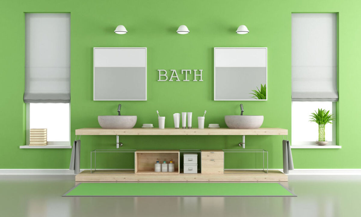
Green paint can bring the outside in and help create a tranquil bathroom. archideaphoto/Thinkstock photo

Different shades of purple provide creative stimulation in a living room. archideaphoto/Thinkstock photo

Bright yellow works well for an accent wall or one large piece of furniture in a kitchen. Vicheslav/Thinkstock photo
FALLBROOK – Painting is one of the easiest and least expensive ways to transform the look of a space. The colors homeowners choose for their walls can give rooms their own unique feel and even affect the moods of the people within them.
Finding the right shade for a bedroom or kitchen involves more than just selecting the first color that catches your eye. Design experts and psychologists alike say it may be worthwhile to choose a color that helps you feel good rather than just following design trends. The paint color you pick may add energy to a space or create a tranquil retreat where you can unwind at the end of the day.
Blue
To create a spa-like environment and a more serene space, look to shades of blue in soft variations. Cool blues are soothing colors that can help lower stress levels and promote sleep. That's why blue is a frequent fixture in bedrooms and bathrooms. Just be advised that too much blue can make a room appear cold and stark, so balance out blue with some warmer accents.
Orange
Many people do not immediately consider bright orange for their homes, but when used as an accent shade, orange can really brighten up a home. Orange is considered a shade that expands creativity and imparts a youthful appeal to a space. Consider an orange accent wall or a burst of color with orange throw pillows. If pumpkin orange is a little too bold for you, tone it down by choosing a more pastel, peachy hue, which is equally warm and energizing.
Red
Red stimulates energy and appetite, which is why the shade is so popular in restaurants and home dining spaces. Red is a good choice for social gathering rooms but may not be the wisest choice for a bedroom, as the color may prove overstimulating.
Green
Green can evoke composure and tranquility and works in any room of the house. Since green is the primary color of nature, it also works well for those people who want to bring some of the outdoors inside and work with the fresh starts and new growth that green can inspire. To make green feel less subdued and sleepy, work with its complementary opposite, red, by using a few bold red accents here and there to balance out the tranquility of green.
Purple
People have long related purple to royalty, and this dramatic color can add a formal, regal aspect to a home depending on the hue. Purple also may help stimulate the creative side of the brain. In paler shades of lavender, purple can seem almost ethereal and spiritual. Some designers suggest avoiding purple in a bedroom because that is a place you want your brain to rest rather than be stimulated.
Yellow
Few colors are more vibrant than yellow, which can help stimulate conversation and make thoughts more focused. A luminous shade of yellow is an ideal way to make any space more welcoming and bright. Just use it sparingly, as too much yellow may not be a good thing. Yellow accents mixed with touches of purple can offer the balance needed to prevent yellow rooms from overwhelming residents and guests.
Home decorators should keep in mind that colors can be blended to create the desired environment. A color scheme based on complementary colors, or those opposite on the color wheel, may fit. Otherwise, analogous color schemes, or those colors that are next to one another on the color wheel, can create a variation that suits your design needs.


Reader Comments(0)